History Of PILS Logo

PILS logo consists of hands that wrap around the globe with a scale of justice.

The Globe

The globe represents our belief that justice is universal and necessary to preserve and protect individual rights, freedoms, liberty, and the common good. It represents that justice should be swift, holds power over us, and is mighty.

The Scales of justice

The scales of justice, which are placed right in the middle, is the most important symbol. This signifies that there should be an equal weighing of two sides in every dispute. It depicts a fair balance between the interests of one individual and those of another.

The Hands

The hands around the globe represent our ambition to bring PILS to the international plane with our dedication and achievements. We believe that it is part of our job to learn so that we can work with our justice system to achieve peace.
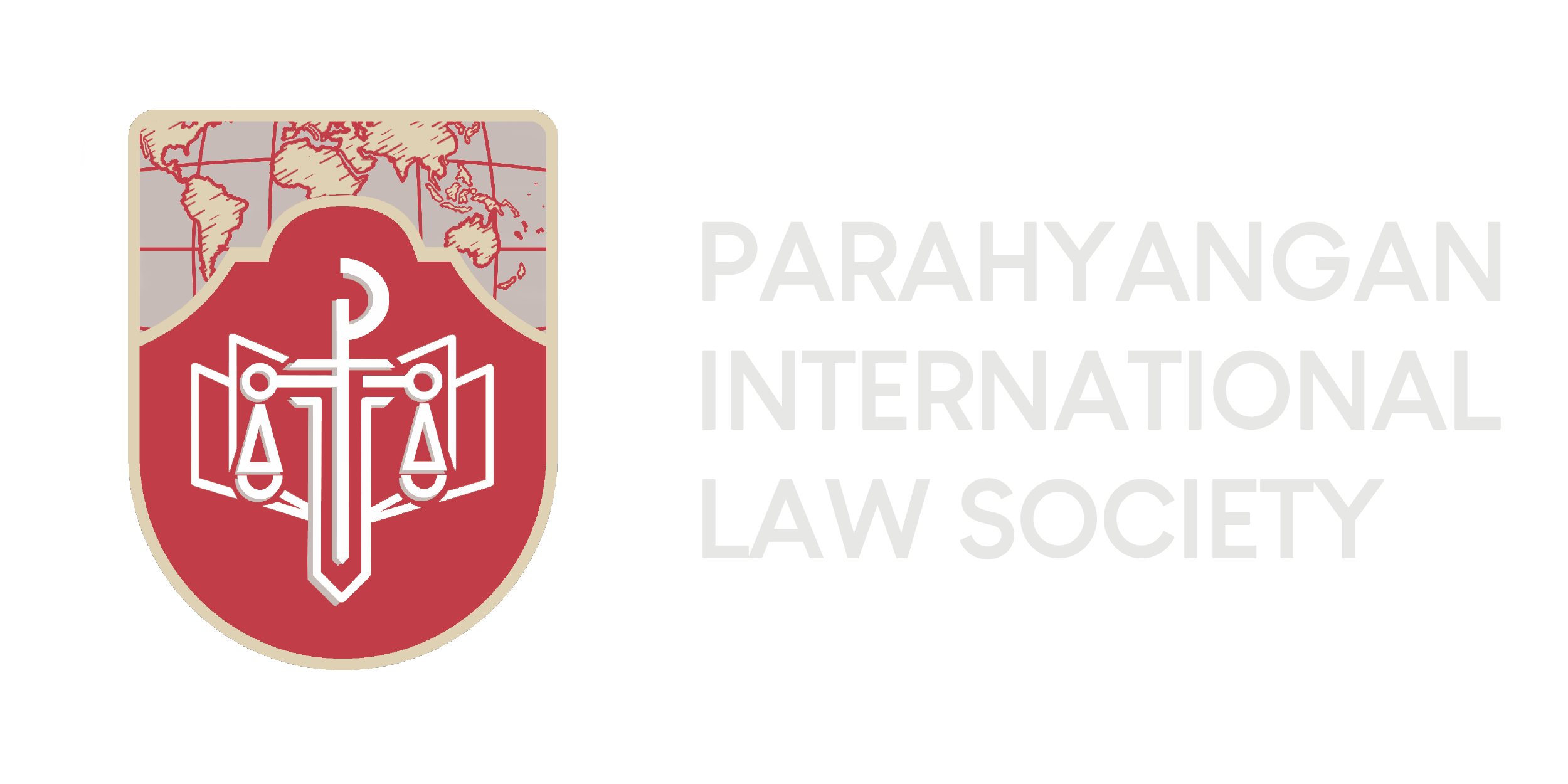
Newest PILS Logo

We have designed a new logo to better represent the evolution of our character; our core values of competence, integrity, and professionalism; and our renewed commitment to the pursuit of legal knowledge.

The SHIELD

The shield represents our goal to protect the upholding of law and fairness.

The WORLD MAP

The world map represents our character which extensively focuses on international law.

The SWORD

The sword represents decisiveness, integrity, and accountability in our pursuit of justice.

The SCALES OF JUSTICE

The scale of justice represents our moral obligation to work for fairness and impartiality.

The Book

The book represents our dedication and obligation as law students to always seek excellence in our pursuit of a legal education.

We are proud to announce the launch of our complimentary logo to commemorate 15th anniversary of PILS

After careful consideration, we have chosen a complimentary logo to reflect the journey we started since 2005. As well as an orientation for growth, while remaining true to our longstanding reputation!

Proud as we are of our rich history and deep roots, we retain the official logo’s core elements, the scale and the hands holding a globe. We also keep the circle shape as it symbolically create the impression of a whirling cycle that denotes ongoing dynamism. As part of our brand refresh process, we wanted to take a fresh look at our colors.

RED

our logo reflects the bold, passionate and forward-looking culture of our organization

White

The second dominate color implying fairness and independence.

Dark Blue

as a shadow color which inspires fairness and independence cannot exist without integrity and honesty.

Versatile colors

that can be combined with other strong colors, such as muted green and taupe to emphasize warm and growth.